Welcome to The Garden
Moderator: mart
-
Hell and High Water
- Site Admin
- Posts: 1948
- Joined: Fri Jul 17, 2009 2:30 am
Re: Welcome to The Garden
The first one starts, but the second one needs a push. It's programmed in the file I'm sure.
-
Hell and High Water
- Site Admin
- Posts: 1948
- Joined: Fri Jul 17, 2009 2:30 am
Re: Welcome to The Garden
Actually the orange and red one is Tekton. Tekton is cool, really.Hell and High Water wrote:Oh yeah, those. We'll have to talk with M&MM.
I can change the 3myl, does it really bother anyone?
ETA: Oh, and Autumn. I'll definitely do that one.
-
Pitifuljoy
- Confirmed User
- Posts: 748
- Joined: Mon Aug 10, 2009 3:25 pm
- Location: Long Beach, CA
Re: Welcome to The Garden
Yes, it does. *puts protective sunglasses on*Hell and High Water wrote:I think it actually makes their eyes burn.

But as a graphic designer, I was *forced to sign this:

*and by forced I mean I signed right away because I totally agree

In all seriousness though, it never really bugged me. I mean, it did at first, but

Also, that flash auto-plays. Was quite funny trying to figure out how to stop it since for me, the option showed up in Japanese, and uh, I can't read Japanese

-
Hell and High Water
- Site Admin
- Posts: 1948
- Joined: Fri Jul 17, 2009 2:30 am
Re: Welcome to The Garden
^ Japanese?!? LOL, maybe you'd better reinstall your fonts!
Comic Sans' greatest crime is that it has been so over used, I generally avoid it. Hobo was too in it's day, but it's been a while so I slip it in here and there. Papyrus is in the Hermes style here, it's been popping up all over, but I'm not sick of it yet. But when a business uses a font for their logo, without doing anything creative with it, it's time to move on.
If I was a real fontographer, I'd create a font based on samples of PJ's handwriting. But I'm not.
Comic Sans' greatest crime is that it has been so over used, I generally avoid it. Hobo was too in it's day, but it's been a while so I slip it in here and there. Papyrus is in the Hermes style here, it's been popping up all over, but I'm not sick of it yet. But when a business uses a font for their logo, without doing anything creative with it, it's time to move on.
If I was a real fontographer, I'd create a font based on samples of PJ's handwriting. But I'm not.
-
Pitifuljoy
- Confirmed User
- Posts: 748
- Joined: Mon Aug 10, 2009 3:25 pm
- Location: Long Beach, CA
Re: Welcome to The Garden
^
The problem I have with Comic Sans is that it really doesn't go with anything. It's not playful, its not serious. its just there in all its ugly glory. Have you seen the documentary "Helvetica" by any chance? If you haven't, its a pretty cool docu on this very subject. Ok derailing this thread...uh....yeah Japanese! It took 3 tries to get it to pause.
The problem I have with Comic Sans is that it really doesn't go with anything. It's not playful, its not serious. its just there in all its ugly glory. Have you seen the documentary "Helvetica" by any chance? If you haven't, its a pretty cool docu on this very subject. Ok derailing this thread...uh....yeah Japanese!
It took 3 tries to get it to pause. -
Hell and High Water
- Site Admin
- Posts: 1948
- Joined: Fri Jul 17, 2009 2:30 am
Re: Welcome to The Garden
I think I did see "Helvetica," some time ago. Hmmm.
Comic sans was created by Microsoft, not particularly known for their artistry, but at the time it was welcomed as a casual font that looked good on Web sites. Web sites are pretty low resolution and curved lines were a problem, especially for plain text. Up to then, your choices were Helvetica, Arial or Times, that was about it. But then it spread....
Comic sans was created by Microsoft, not particularly known for their artistry, but at the time it was welcomed as a casual font that looked good on Web sites. Web sites are pretty low resolution and curved lines were a problem, especially for plain text. Up to then, your choices were Helvetica, Arial or Times, that was about it. But then it spread....
-
yarnforhair

- Confirmed User
- Posts: 681
- Joined: Sun Jul 19, 2009 5:13 pm
- Location: dreamland Ohio
- Contact:
Re: Welcome to The Garden
best font everHell and High Water wrote: If I was a real fontographer, I'd create a font based on samples of PJ's handwriting.
if there's a want for something new, you might find me at the start, or where it ends for you.
-
Pitifuljoy
- Confirmed User
- Posts: 748
- Joined: Mon Aug 10, 2009 3:25 pm
- Location: Long Beach, CA
Re: Welcome to The Garden
Another reason to prove that Microsoft is EVIL!Hell and High Water wrote:I think I did see "Helvetica," some time ago. Hmmm.
Comic sans was created by Microsoft, not particularly known for their artistry, but at the time it was welcomed as a casual font that looked good on Web sites. Web sites are pretty low resolution and curved lines were a problem, especially for plain text. Up to then, your choices were Helvetica, Arial or Times, that was about it. But then it spread....
This conversation reminded me of this article I read earlier this year. Pretty interesting stuff.
http://online.wsj.com/article/SB1239923 ... =yhoofront" onclick="window.open(this.href);return false;
The only part of my career that I hate is when I create a decent, clean design and the client gets back to me with a "can you change the font to comic sans?" Just makes me wanna kill them and rip my hair out in the process.

-
yarnforhair
- Confirmed User
- Posts: 681
- Joined: Sun Jul 19, 2009 5:13 pm
- Location: dreamland Ohio
- Contact:
Re: Welcome to The Garden
ew people actually say that?Pitifuljoy wrote: The only part of my career that I hate is when I create a decent, clean design and the client gets back to me with a "can you change the font to comic sans?" Just makes me wanna kill them and rip my hair out in the process.

i can't get that flash thing to stop :l
if there's a want for something new, you might find me at the start, or where it ends for you.
-
Hell and High Water
- Site Admin
- Posts: 1948
- Joined: Fri Jul 17, 2009 2:30 am
Re: Welcome to The Garden
Ha, I actually read that article too. Poor guy, lol.Pitifuljoy wrote:http://online.wsj.com/article/SB123992364819927171.html?mod=yhoofront
The only part of my career that I hate is when I create a decent, clean design and the client gets back to me with a "can you change the font to comic sans?" Just makes me wanna kill them and rip my hair out in the process.
Once you're aware of it, you find that it is, in fact, all over.

I drove by a sign yesterday, somebody thought it made their business name look cool. Ehrrrr.
I'll email M&MM.
-
Hell and High Water
- Site Admin
- Posts: 1948
- Joined: Fri Jul 17, 2009 2:30 am
Re: Welcome to The Garden
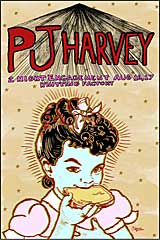
Ok, so M&MM said fine of course. I want to keep the image of Polly on the default page, just because it's kind of our brand by now. But let's change the font. Any suggestions? I like having two different typefaces, one for each line.
-
Hell and High Water
- Site Admin
- Posts: 1948
- Joined: Fri Jul 17, 2009 2:30 am
Re: Welcome to The Garden
Comic sans is gone, what do you think of the "Harrington" and Legacy sans combo?
-
Pitifuljoy
- Confirmed User
- Posts: 748
- Joined: Mon Aug 10, 2009 3:25 pm
- Location: Long Beach, CA
Re: Welcome to The Garden
I noticed the change today  . Since I'm using the "hermes style" I don't really see it all that often. But, anything is better than comic sans . I was going to contribute a few options, but I'm a huge typeface nerd and would have probably made 3,000 possible variations.
. Since I'm using the "hermes style" I don't really see it all that often. But, anything is better than comic sans . I was going to contribute a few options, but I'm a huge typeface nerd and would have probably made 3,000 possible variations. -
Pocket Knife

- Site Admin
- Posts: 588
- Joined: Sat Jul 18, 2009 3:50 am
- Location: at the end of this burning world
- Contact:
Re: Welcome to The Garden
I like it just fine. If people still have a problem with it please make suggestions.
Contact The Garden Staff at gardensupport@gmail.com
Find us at
Twitter
MySpace
Facebook
Find us at
MySpace
-
Hell and High Water
- Site Admin
- Posts: 1948
- Joined: Fri Jul 17, 2009 2:30 am
Re: Welcome to The Garden
Hah! Yeah I was trying to avoid that. I could spend hours trying different combinations, but I thought Harrington looked "Gardeny" and stuck with it, although it was my first pick.Pitifuljoy wrote: I'm a huge typeface nerd and would have probably made 3,000 possible variations.

It's easy to change though, even the "shadow" is a typeface in Photoshop, something I'd never tried before. Using the transform tool in Photoshop, I grabbed the top and pulled it below the bottom, inverting it. So it's still editable text. Fascinating eh?
