Just wanted some opinions please as to whether you think these images work for the material?
It's for a
CD redesign student project (PDF file), and I'm approaching it like it was a Special Ed. w/ The Nightingale, with outer card packaging too (with Polly on the front cover this time obviously

).
I guess it's a bit open to personal interpretation though, as Pollys always saying.
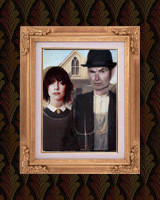
The original is b+w, minimalist for understandable reasons, so I've tried to keep to that kind of form, though a bit more decorative (script rather than monotype, 'shaking' text). I usually scour the internet looking for images for this kind of thing, but Seamus Murphys site was perfect for most of them, well worth a visit. I think I might have run out of ideas when I got to the Nightingale though

Thanks in advance.